Branding
The Principle of Mutual Restraint: Calibrating Palette and Typeface Personality
Insights, tutorials, and type notes from the Timeless Type studio.
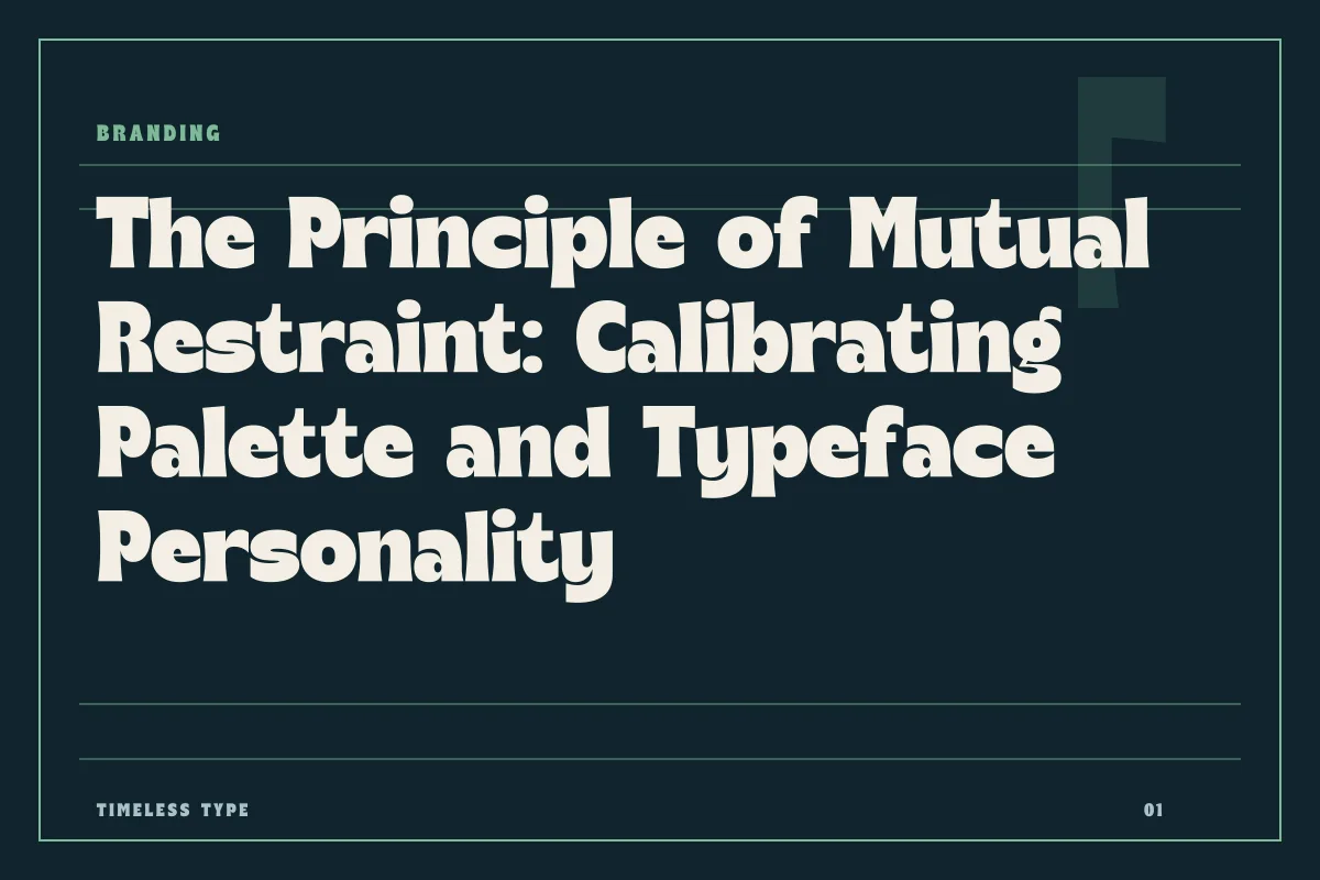
A stable identity system recognizes that color saturation and typographic flair serve the same expressive purpose, requiring one to step back so the other can speak clearly.
Table of Contents
The Single Channel of Immediate Perception
When an audience encounters a visual identity, their perceptual system does not process chromatic intensity and glyph architecture as separate layers. Instead, the brain compresses color, silhouette, contrast, and rhythm into a singular initial sensation. When a brand attempts to inject intense narrative energy into its color palette while simultaneously choosing an eccentric, highly sculptural letterform, the result is rarely double the impact. More often, it produces perceptual friction, forcing the eye to scramble between decoding complex shapes and absorbing aggressive hues.
Both typography and color share the same fundamental job: establishing tone, tempo, and immediate brand recognition before the viewer reads a single word. Because they address the same cognitive channel, they exist on a see-saw. Elevating the expressive volume of letterforms requires lowering the visual temperature of your palette, and saturating an identity with vivid, high-chroma tones necessitates letterforms that are structurally grounded and quiet.
The Cost of Competing Accents
Graphic designers frequently fall into the trap of compounding expressive techniques. If a brand identity feels too subdued during early iterations, the instinctive reaction is often additive: add an energetic display typeface, and then set that display typeface in an electric, neon gradient or a multi-chromatic palette. This approach mistakes sheer stimulus for intentional character.
When a display face with prominent visual eccentricities—such as swollen terminals, radical contrast, or flared serifs—is rendered in a vibrating color combination, the anatomy of the letters collapses into the background noise. Readers end up working twice as hard: first to resolve the contours against competing hues, and second to parse the linguistic meaning of the headline. By forcing type and color to shout simultaneously, neither element retains the clarity required to establish authority.
Allowing Expressive Type to Command the Monolith
When a brand concept relies on the unique formal personality of its letterforms, the color palette must adopt a supporting role. Structural idiosyncrasy demands neutral territory. Setting an intricate or theatrical face in a restrained palette allows its contours, x-height shifts, and stroke transitions to function without distortion.
Consider an exuberant, retro-inflected display face like Lemon Burst - Groovy Display Font. The letterforms contain pronounced swells, organic bends, and historic personality. If you render this face in an acid yellow atop a violet backdrop, the viewer registers chromatic shock rather than typographic craftsmanship. However, when placed in deep charcoal over an off-white substrate, or rendered in a single disciplined forest green, the rhythm of the outlines carries the entire narrative weight effortlessly.
Similarly, an authoritative voice built upon Manile Vintage - Modern Bold Serif achieves gravitas precisely because its sharp brackets, high stroke contrast, and vintage terminal cuts are allowed to resolve cleanly against muted editorial backgrounds like raw linen, warm paper, or slate.
Anchoring High-Chroma Palettes with Structural Discipline
The inverse principle holds true when color is intended to be the central pillar of an identity system. Many contemporary brands build their equity around a hyper-saturated, signature hue—a blinding electric cobalt, safety orange, or radiant magenta. In these scenarios, the typography cannot afford to draw attention to its own formal quirks.
When the palette provides the primary emotional surge, letterforms must supply structural stability. They serve as architectural lintels holding up a wall of color. Workhorse sans serifs with disciplined proportions, disciplined terminal angles, and predictable rhythm thrive in this environment. A face like Newstan – Tall Condensed Sans Serif gives layout designers vertical density, mechanical clarity, and unmistakable order. The condensed, straightforward architecture organizes information reliably without generating decorative friction, letting intense field colors drive the emotional punch.
Auditing the Visual Load of Brand Assets
Determining which element takes the lead is an editorial decision that should occur during the foundational phase of identity development. To verify that an identity system is balanced rather than overcrowded, design teams can test their applications against several diagnostic criteria:
- The Grayscale Inversion Check: Strip all color from the layout. If the typography still communicates the intended brand mood entirely on its own, your letterforms are doing the heavy lifting, and your color palette should remain calm.
- The Squint Test: Blur your vision slightly at arm's length. If the layout breaks into fighting focal zones where text anatomy clashes with color blocks, eliminate chromatic complexity.
- Substrate Contrast Ratios: When working with high-character display faces, ensure the background and foreground values preserve crisp edge contrast, avoiding vibration along stroke contours.
- Role Designation: Explicitly document within your identity guidelines whether color or typography serves as the primary character driver, establishing boundaries for production designers.
Establishing Long-Term Systemic Cohesion
Balancing these two core assets is not merely an aesthetic preference; it directly influences how sustainable a brand identity is across multiple platforms. Editorial layouts, packaging suites, and software interfaces inevitably demand compromises due to accessibility standards and dense layouts. When you explore curated foundry releases across the Timeless Type fonts library, evaluate each option through the lens of your overall chromatic system.
A brand whose foundation relies on disciplined typographic hierarchy and single-element dominance can scale into any environment without losing coherence. By deciding early whether your typography or your palette carries the megaphone, you give your visual system room to breathe, communicate, and endure.
Related
Tags
Browse similar work by purpose and style.