Tutorial
The Functional Counterweight: Methods for Pairing Display Heads with Quiet Text
Insights, tutorials, and type notes from the Timeless Type studio.
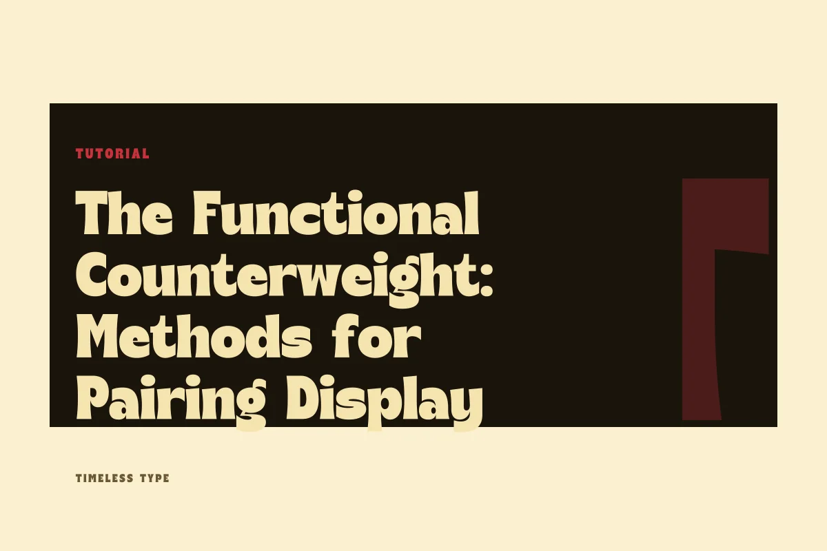
Learn how to coordinate high-impact display lettering with understated reading type across print and digital layouts by assessing contrast, x-height balance, and rhythm.
Table of Contents
The Structural Mandate of High Contrast
Successful typographic pairings rarely arise from polite compromises. When building a brand landing page or an exhibition poster, selecting two fonts that share similar weights, proportions, and stylistic gestures invites visual mud. If a headline uses subtle eccentricities and the supporting body copy carries its own quiet eccentricities, the eye cannot settle on a clear lead voice. To build clarity, a designer must create a distinct functional gap between the focal headline and the underlying text engine.
A dedicated headline face exists to define atmosphere, declare tone, and capture immediate interest. A typeface like Dream Waves - Serif Display Font asserts itself through pronounced curves, deliberate decorative modulation, and high-contrast stroke weight. Because the primary voice delivers heavy aesthetic personality, its partner cannot compete for the same perceptual attention. The accompanying text face must adopt a utilitarian posture, absorbing information delivery without injecting conflicting stylistic chatter.
Evaluating Proportion and Relative X-Height
When coupling expressive display forms with neutral running text, geometric alignment matters far more than historical lineage. The primary physical variable to audit is the relationship between display cap height and text x-height. When an expressive headline sits atop an informational deck or narrative paragraph, the optical density of the body block must feel structurally tethered to the headline above it, rather than floating detached in space.
Display typefaces often carry compressed counters or exaggerated vertical strokes that distort visual volume. For instance, pairing a tall, vertical headline like Newstan – Tall Condensed Sans Serif with an overly compact or tight text face causes the composition to feel pinched and nervous. In contrast, pairing such vertical headlines with an open text face featuring a generous x-height, clear apertures, and wider letter spacing grounds the composition. The generous baseline of the text face acts as a horizontal foundation beneath the vertical tension of the headline.
Diagnosing the Tipping Point: When Pairings Collapse
Pairings typically fail under three predictable conditions: competing cadence, scale collapse, and conflicting structural skeleton. Competing cadence occurs when both faces attempt to be expressive in divergent stylistic directions. If you combine a rhythmic, organic script or a novelty serif with an idiosyncratic text face that features odd terminals or humanist quirks, reading speed drops abruptly as the eye attempts to reconcile two conflicting aesthetics.
Scale collapse happens when a designer fails to push point size differentials far enough. If a display title is set at thirty-two points and the introductory deck is set at twenty-two points, the layout sits in an uncomfortable gray zone. The viewer cannot immediately perceive which element establishes the narrative priority. A true pairing requires an unambiguous scale ratio—often three to one, or five to one—ensuring the display face functions purely as display and never blurs into sustained reading duty.
Field Checklist for Posters and Digital Interfaces
Before locking in a combination for client deployment or production release, test your two selected typefaces against this diagnostic routine across varied formats:
- Inspect the optical weight relationship to ensure the text block does not appear visually heavier than the display title when viewed from three paces away.
- Set the quiet text face at eight, ten, and twelve points to confirm its apertures remain crisp and legibility does not degrade under low-contrast conditions.
- Test a secondary headline level to see whether it should be handled by a scaled-down version of the display face or a heavier cut of the neutral text face.
- Check that structural details, such as stroke terminals and serifs, do not fight each other; when in doubt, contrast an ornate display serif with an austere, unadorned grotesque sans.
- Audit the kerning and tracking, ensuring the display head is kerned snugly for cohesion while the text face is given sufficient tracking for breathing room.
Preserving Layout Cohesion Across Scales
Once you define the display-text hierarchy, the remaining design decisions become simpler. Every secondary level—captions, metadata, folios, and form labels—should draw exclusively from the quieter text family. Introducing a third typeface is almost never necessary and frequently ruins the disciplined asymmetry established between your display lead and body engine.
For projects demanding grounded slab architecture, a face like Glinos - Modern Slab Serif provides firm, muscular display framing that easily anchors straightforward, neutral text blocks. When browsing our curated library across our typography catalog, observe how extreme character forms thrive only when given the oxygen of silent, orderly companion typography. By treating the display face as architectural sculpture and the text face as clean structural engineering, your posters and digital layouts will command immediate focus while remaining effortlessly legible.
Related
Tags
Browse similar work by purpose and style.