Tutorial
Engineering the Two-Face Hierarchy: Contrast, Proportions, and Breakdown Points
Insights, tutorials, and type notes from the Timeless Type studio.
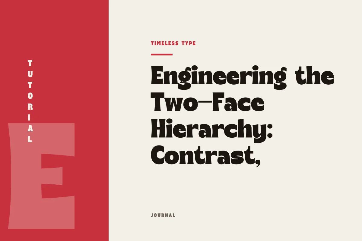
Pairing a magnetic display face with an understated text partner requires careful management of x-height, stroke contrast, and layout thresholds to avoid visual discord.
Table of Contents
The Functional Separation: Lead Voice Versus Infrastructure
In graphic design, a typographic pairing is rarely an equal partnership. When laying out a poster, an editorial spread, or a digital landing page, attempting to give two typefaces equal stylistic prominence results in competitive friction. The viewer’s eye is drawn simultaneously in multiple directions, creating fatigue before any message is absorbed. A resilient two-face system establishes a clear division of labor: one typeface delivers expressive identity at large scale, while the second provides structural clarity across continuous reading environments.
Consider a design anchored by a dramatic headline. A titling face such as Dream Waves - Serif Display Font carries generous organic motion, calligraphic terminals, and pronounced stroke modulation. Its purpose is immediate recognition and atmospheric tone. If you place a similarly expressive secondary font immediately below it, the composition collapses under its own decorative weight. The companion text face must be utilitarian, allowing the primary display choice to claim visual focus without competing for attention.
Managing Vertical Metrics and Perceived X-Height
The primary mechanical hurdle when pairing disparate letterforms is reconciling their vertical metrics. While font size is nominally measured in typographical points, perceived optical size is governed by x-height—the vertical distance between the baseline and the median of lowercase glyphs. Two typefaces specified at 16 points can look drastically different in physical scale if one possesses a compact x-height with extended ascenders while the other features an expansive core with clipped vertical strokes.
When a display face commands the top of the hierarchy, its x-height often veers toward the extreme: either noticeably condensed and tall to optimize headline density, or deeply classical with short lowercase letters that accentuate elegant capitals. If the body face shares neither the optical ratio nor an intentional counter-ratio, the transition from title to text feels jarring. For body copy, choose a quiet companion with a generous, open x-height and neutral proportions. This provides visual grounding and ensures comfortable legibility even at modest point sizes, keeping the layout legible regardless of the headline’s idiosyncratic proportions.
Dialing the Contrast: Stroke Weight and Text Density
Pairing is an exercise in intentional contrast rather than subtle resemblance. Ambiguity is the enemy of typographic clarity; choosing two fonts that look almost identical, but deviate in small mechanical details, registers to the viewer as a production mistake. When pairing a high-presence display design with a neutral partner, ensure contrast exists across at least two fundamental axes:
- Stroke Modulation: Pair high-contrast, variable-thickness display strokes with a low-contrast, monolinear text partner to prevent visual vibration in dense paragraphs.
- Density and Spacing: Offset tightly tracked display titles with comfortably tracked, open text settings that breathe naturally on the page.
- Structural Form: Couple idiosyncratic geometry, such as the expressive swoops of Manile Vintage - Modern Bold Serif, with an unadorned, humanistic, or geometric neutral companion.
- Scale Hierarchy: Maintain a definitive scale step—typically a jump of at least 3:1 between primary titling and explanatory copy—so the reading sequence is unmistakable.
By enforcing clear differentiation across these dimensions, the secondary typeface fulfills its role as an efficient delivery mechanism for information, while the display face remains an uncompromised focal point.
Diagnosing Failure Points: When the Stack Breaks Down
A pairing that looks balanced in an isolated thumbnail can rapidly disintegrate across dynamic layouts. Failure usually occurs when the structural parameters of the text face conflict with the reading distance, medium, or density of the composition. Identifying these failure modes early in the design phase prevents costly revisions.
The most common breakdown is the intermediate hierarchy failure. When an editorial layout requires subheadings, pull quotes, lead-ins, and body copy, designers often struggle with where the display face stops and the text face begins. If you attempt to force an expressive display face down into subheads below 24 points, fine stroke details dissolve, letterforms blur, and reading rhythm halts. Conversely, if you bump the text face up to intermediate sizes without sufficient weight differentiation, the page looks disjointed. Resolve this by restricting the display cut strictly to hero titles and primary statements, relying on bold weights or small caps within the text family to handle secondary navigation.
Practical Implementation on Posters and Web Pages
Executing a two-face pairing in production environments requires specific adjustments depending on format. On a print poster, spatial boundaries are fixed, allowing you to manipulate white space, line height, and margin density with high precision. Here, the display font can bleed toward the edges or overlap subtle gridlines, provided the accompanying paragraph block sits comfortably in a high-contrast negative zone with generous line spacing.
On responsive brand pages, the layout must withstand shifting viewports. When reviewing specimens across our font collection for web deployment, verify that the text partner renders crisply across various operating systems and device screens. Set text line-height generously—generally between 140% and 160% of font size—to ensure paragraph blocks hold a stable grey value on screen. By anchoring your identity with a single distinctive display face and supporting it with an unpretentious, technically robust text companion, you produce layouts that are visually memorable without sacrificing functional utility.
Related
Tags
Browse similar work by purpose and style.